This blog is for anyone interested in Art. I hope to share tips,lessons and if possible some advice on creating your own masterpieces! I want to exchange ideas and techniques as I give step by step advice from beginning to end on whatever piece I am working and I strongly urge anyone with questions to feel free to ask!
To view more works and tutorials please go to www.facebook.com/stacyvaughndavis where you will be able to find and follow along with my most recent works and tutorials. Thank you!
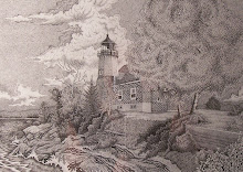
As you are stippling in the walls to any buildings always keep in mind how dark you want the subject. Everything you add now will always affect everything else in the piece and it is difficult at best making something that is to dark initially work so always when stippling try and take a sample sheet and do some different stippling techniques going from loose which will make a light shading and tight stippling which will create a darker shadow, it all depends on the looseness & tightness of the stippling. In the sample photo I have included on this post I want you to notice and study the stippling technique along each shaded sides of the buildings. In the distant building I used a loose uniformed stippling technique (using the .25 mm pen) and then I went back over and used some quick pen strokes giving the feel of the grain of wood. Then in the building closest in the view I only used fairly loose stippling on the shaded side of the building and if you will notice I also added small vertical hatches along the siding itself. Once I have decided just what type of detail I want to add to each I always use a fairly loose stippling technique because you can always come back and add more stippling or cross hatching or whatever. The point being less is more. The car directly in front of Norms’ Bar I also stippled in using the .25 mm pen but I used fairly tight stippling here and also if you will notice, I have left the windows of the passenger side of the cars that you can see through the rear window blank for now. I’ll only be able to decide what and how I want to create the affect there when I have completed the front of Norm’s Bar. Now the tree’s that are along the side of Norm’s Bar I will leave undone until I have did all the pen work along that side of the wall. I can the come back in and complete all the tree branches. Remember to outline all your tree’s that are located in front of any subject you are working on. I sometimes will not and end up going over them without realizing I wanted a tree there in the first place. That can ruin a piece so be careful. If there is any artwork that you are interested in and have seen here can be viewed and purchased at the Copper Country Community Arts Center / The Kerredge Gallery, 126 Quincy Street. Hancock Michigan. Just contact me and let me know which piece you are interested in or contact Cynthia Cote’ at (906)-482-2333 and let her know the Title of work and if is not at the Gallery itself I will bring down for you to view, you can set an appointment at your convenience. We will continue with techniques used to create the shading in the walls in next post. I will do my best to post a lesson every Sunday or Monday, it all depends on any shows or exhibits I am doing. Any questions let me know.
Now we will begin on the walls of the buildings and the techniques used. You will have to be the judge of how dark or light you want to create them but remember that after I have finished the initial stippling the create the tone and texture you are looking for you have to keep in mind that you will have to come back into the same walls and add more texture and life to it so just always keep this in mind. If you add to much stippling or create it to tightly it will just make the walls far to dark or limit the texture you can add later which will affect the overall piece dramatically. To begin the walls on either of the subjects I first decide how dark and rich I want to make each building, what is the subject I want to concentrate on and make that the thing in which everything else will flow into. Study each building in each sample photo I post. You will be amazed by how much you will actually pick up just by studying what I am providing on each post. Now once you have decided on how the piece shall work out begin stippling whichever building you want the most attention on and stippling in by using the .25 mm pen. Complete the entire building and make sure you keep the stippling uniform. Now the buildings will take at least two to three posts so just get the stippling completed o each building making sure that each will have either more tightly placed stippling or loose stippling. I’ll cover details such as cracking in the siding along each building and hw to create any shadows falling along them. I also will be posting my lesson blogs on Facebook…but since I cannot actually remember the site address just go to Facebook and search “Stacy Vaughn Davis”…you should be able to find me but if not let me know.
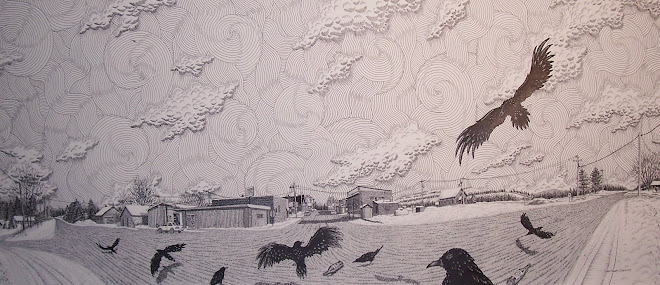
First I would like to let you all know that this will be the last lesson post I will make here on Yahoo 360 since will be closing in July. I will try and leave this post on 360 as the final post so everyone will have a chance to take note of my Flickr and Blogger and also Yahoo Profile site address’. I will continue the lesson post along with sample photos on the above mentioned sites and also you all can contact by e-mail with any questions you may have. Now in this lesson I have just continued with the stippling using my .25 mm pen but before I did I sketched in some crow’s directly behind me and will just ignore the crow flying above. I often do this in a piece because you just get better idea’s as you are delving into the piece and I like what came to me so I went with it. I just used my .30 mm pen to ink the birds in remembering to leave the highlights of the feathers visible where later in the piece we’ll come back and add detail to them but for right now just ink in the birds. I also used the .30 mm pen to begin lining in the fence to the right. I also used my .30 mm pen to complete the curved line work running along either side of the pole just in front of the wooden fence. In the next post I’ll begin working on the buildings behind my subject. Also when viewing the Blogger site when you click on the sample photo’s provided with each lesson you will be able to see in greater detail the techniques used for those of you that may be visually impaired and want a higher resolution sample photo. But Flickr has the exact same posts along with sample photo’s although not as high of resolution. Just something to keep in mind. As of right now I am having troubles using the photo upload on the Yahoo Profiles site so anyone viewing there will need to use Flickr to view the sample photo’s.
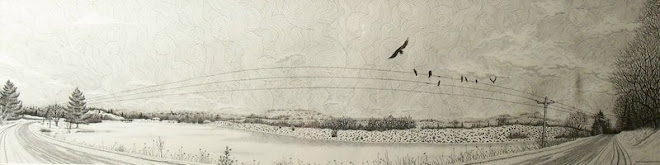
Now once I have completed outlining one side of the work I complete the line work in the distant tree line using my .30 mm pen to do the vertical line work along with some distant pine trees and telephone line poles. I then will take my .25 mm pen and add some more vertical line work to the distant tree line to add depth and tone. I continue with my .25 mm pen and begin working on the actual power and telephone lines crossing my skyline of the piece. I also begin stippling in the road and sidewalk. The road and sidewalk will be stippled entirely but I will go back in later on in the work’s progress and add anything like potholes and cracks and things of that nature. Do not worry about that now…focus on the first steps and follow each step and the work will come out great…rush anything and you will have problems. You will also notice I have some birds sketched out…ignore those for right now. Chances are I may not ink those in and go with something different but in any case I usually leave the sky for last but what ever works for you is what you go with, I just give suggestions. Remember that 360 will be closing on July 13th 2009. You will still be able to follow along on the sites I have provided below.
Well I hope everyone had enough time to get the graphing done and the sketch of either the photo sample I provided or your own photo completed up to now. Also I would like to inform everyone that with Yahoo 360 closing I will be posting on Yahoo profiles, Blogger and Flickr from now on. My Yahoo profiles address is http://profiles.yahoo.com/stacyvaughn68 and is basically the same as 360 and Facebook. My Blogger address is www.stacyvaughndavis.blogspot.com which when you view the sample photos at this site the photos will actually upload much larger which will enable you to see so much more detail and finally my Flickr address is www.flickr.com/stacyvaughn68 which I will also be posting the lesson and sample photo(s). You will still be able to contact me with any questions. Now back to the lesson. As you can see by the sample photo I first did my graph and when that was completed I began the sketch in of my work. You don’t have to get every single detail from the photo you may be working on sketched out. Just go for the basics and forget the smaller details that would not be seen with the naked eye anyway. Do not try and sketch out in pencil every tile on a side of a building or every crack in a sidewalk…just think of it as a coloring book where you will add all the details when you are inking in. Keep the pencil sketch very simple like in my sample photo. Once this has been completed take your .25 mm pen or your .30 mm pen and begin inking in the outlines of the buildings, sidewalk and telephone and power lines. Also take your .25 mm pen and add any tall grasses or distant tree lines in. If you want to you can add some stippling using the .25 mm pen along the shaded sides of the buildings once you have completed inking in the outlines. Remember to ink in any tree’s that are in the foreground before inking the buildings in. We will begin adding more details in next lesson post. REMEMBER!!! Yahoo 360 is closing on July 13th so write down the address so you do not miss any lessons.
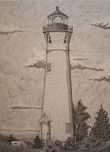
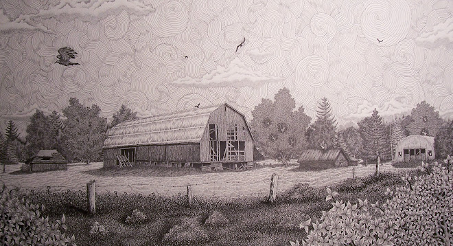
On the new piece I have begun I wanted to concentrate on how I create buildings and the techniques I use to do so. I have included a photo of North Republic, Michigan the subject I have chose to do. You can substitute what ever you want and I strongly encourage you to do so but if you want you can work along with this one. I am roughly about 50% completed with this piece and on a scale of 1 to 10, 1 being simple and 10 being extremely difficult I would rate this piece an 8 due to the fact that this will be mostly stippling and fine line work. If you will be using the same subject photo as I am I suggest printing photo out as a 4” x 6” photo. Once you do that graph the photo out and then ready your working surface and then transfer that same graph to it by using this as a rule when graphing…if you have 1” squares graphed out on your photo then you can either transfer the same size to your work surface or what I do is enlarge it by at least a 1” = 1 ½” scale. Do not enlarge much over 2”. If you do go over 2” it will tend to distort the subject when transferring the sketch. Get the graphing and layout sketch completed while waiting for next Monday’s post.
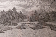
Now to complete the piece I completed the distant tree line much as I explained in the April 16th post but I will only use my .25 mm pen and I will not worry about any detailed trees, just use small vertical lines and remember to layer them and then if you have enough space add some very small pine trees by just scribbling them in quickly. I then will take my .30 m pen and finish stippling in the area along the road. You will have to determine how much you want in your piece but I decided to stay true to this area and add some deer tracks along with my nieces footprints in the snow. Keep in mind where your source of light is and then stipple everything in according to how the shadows will fall. Once I have that completed I will then complete the sky by using my .30 mm pen and stippling in the clouds and filling in around those clouds with very tight uniformed stippling. Once that is finished I switch to my .25 mm pen and then add fine detailed stippling to the clouds. Just some loose stippling will work well. Refer to the completed piece for more detailed sample photo. In the next post I will begin a new piece that I have yet come up with a certain title yet. This piece is more complicated and will once again have use of conte’ pencils again. Choose what subject photo you want to work on and then have your work surface prepared for next lesson.
I apologize for no posts in the past few weeks but my younger sister Karen passed away in late April and I have been mourning her loss and will continue to do so for quite some time. But I do want to again apologize for the lateness in my posts and will continue where I left off in April on May 11th 2009 and ask for your understanding and patience. I also would like to remind everyone that “Through My Eyes in Black & White” has opened at the Kerredge Gallery located in the Copper Country Community Arts Center in Hancock Michigan. The exhibit runs through May 5th -30th 2009 with a public reception on Thursday May 7th from 6pm-8pm but as of right now I do not feel I will be up to the Gallery talk so a statement will be read if I cannot make the opening reception and apologize for any inconvenience this may cause but hope you will understand. I will continue Lessons and Samples from Aprils lessons on May 11th 2009. Thank you.
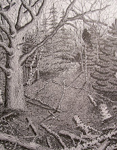
If you’ll look at what I have done on the right hand side of the piece you’ll notice how I try and layer my vertical pen work. I start by drawing uniformed vertical lines and then add more if I want more texture and tone value. Remember that when you do this only apply them about half way to maybe three quarters of the way over your original lines. I am trying to create a good value of tones and if I had brought them all the way over my first application this would just be far darker than I want. I also will do separate bunches giving the feeling of many small tag elders grouped tightly together instead of just one continues bunching of trees. Also study how I have begun creating the tree in tree foreground. I have just drawn its outline and some curved line work to give it shape, I’ll wait later in the work to add detail. The pine tree directly behind it is done by outlining it and then scribble work (refer to study sheets in my Flickr account). Also I began adding some of the stippling details to my nieces jackets using my .25 mm pen. You do not need to do this and for the beginners just concentrate on the trees and surrounding background. I just have a need for a bit of change in techniques and often will jump over to some other subject in my work but I ONLY do this when I have the general sketch work out…keep that in mind. Any questions email me.
Now I need you to refer to the pen & ink tree and foliage studies found on my Flickr account to begin work on the surrounding tree line of this piece. For you beginners I recommend taking a separate sheet of paper and practice these techniques before laying any ink on the actual piece you are working on. Keep in mind that you want to layer the tree line. Sketch in the trees that you want the detail on and then work back with some of the lesser detailed foliage and so on. Once you have those sketched begin inking the outline of them in. Now here is where it gets a little tricky. You will notice that you have spaces of white left in between those trees…here is where vertical lines come in. I want you to use your smaller sized pens and fill in all the spaces between those trees. Remember your perspective and make both your trees and vertical lines smaller and smaller as you work towards the bridge. Now for the tree line behind the bridge this we will do with the same vertical lines but before you do this complete both sides of the road nearest to your subjects. If you have any questions email me.
OK I want to direct this piece mainly at the beginners but is great practice for the more advanced also. I used only my .25 mm and .30 mm pens for this piece along with a mechanical pencil for the graph and the general sketching and also have a Sanford magic rub eraser for any corrections that may need to be made during the sketching and also will be used upon completion of the work when all pen work is completed. Since this was a commissioned piece I basically was confined to doing it from a photo provided. You’ll notice that the photo is in black and white. This wasn’t done specifically for a reason…the only reason was I had no colored ink left in my printer but having said that using a black and white photo as opposed to a color photo makes very little difference. As long as the photo has some workable detail then no problem. When working from a photo, while doing the graph keep in mind that you are able to enlarge the piece by enlarging the graph that you use on your piece itself. Example: If you use one inch square graphing on the photo then enlarge the graph on your piece to one and one half inch squares. Just remember not to go much larger than two inches because will begin to distort. Get this completed and also complete the sketch in work and we’ll cover the beginning pen techniques in next post. Any questions email me.
“A Cold Decembers Day…” This piece I was commissioned to do in late November. The subjects are my nieces Dana and Danielle. It was done for their Grandparents as a Christmas gift in 2008. For this work I only used my .25 mm pen and my .30 mm pen. This work is a break from the last piece requiring less detail work mostly for the fact that it is only an 11” x 14” piece. I want you all to notice in the next post that I have included a photo of how I graph it out and also I want you to notice how I take many liberties on the actual composition itself. Like the fact that I added more snow than was actually upon the ground and also that I added less clouds but we’ll cover those things when we cross those bridges. So in the mean time get your photo prepared and get your table and paper set up along with the graphs IF needed. This will be a simple piece and is ideal for the beginners also. Any questions just email me.
Now for the final lesson and sample for this piece you just need either Conte’ Pencils or some good quality pastels or pastel pencils…whichever you prefer and also your .25 mm pen to complete the stippling in the hat. Now I ca only go over what I HAVE done on my piece so I give it to you step by step. IF you do not have a self portrait of yourself on your piece then ignore this. I first complete my hat by just lining it in with my .25 mm pen and then filling in with some loose stippling. Add more stippling by overlaying to indicate shading and use line work to indicate the stitching in the hat and also any logo’s on it. Once that is complete I clean the pen in my ink cleaning solution and set aside. Now here is the simplest part of the work…this is nothing more than what we did as children with a coloring book our parents bought us. You just color it in! I first begin by using flesh tone colors on my face. I avoid placing any color in the eyes yet . I then switch to a sepia color but just go with what YOU feel is right for you. I sparingly add any shadows to the bridge of my nose and cheeks using a stump to blend both colors to soften it out. ALWAYS add darker colors on lighter colors sparingly because when blending with a stump you’ll be amazed how it can spread. I then add a dark brown to my eyes and use the stump once again to soften the tone. I do the same thing on the fingers starting from light to dark. You may want to leave the large hand for last because you do not want any smearing of colors but you basically will do the same on the small hand as you will on the large. I’ll begin lessons on a new piece I was commissioned to do as a Christmas gift. Any questions just email!
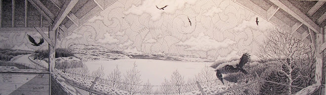
Basically for most of this entire piece I have been using only my .25 mm pen and .30 mm pen. Except for the night sky and also the crow’s which I used my .30 mm pen to outline the high lights on the wings and such then came back and filled in with a 1.20 mm pen which makes filling in large areas of ink so much easier although be careful because does lay down a large amount of ink and tends to dry slowly so pay attention to any chances of smearing the ink into areas you do not wish it to be. Once I completed filling in the large black areas I then used my .30 mm pen to just add some small quick line work to the feathers but not all of them. Keep some of them free of any ink to give more high lights to the birds wings. Now for the background of the sky I used my .25 mm pen and used the swirl technique but much more tightly spaced then in any other piece I have covered before. It is extremely difficult so if you wish you can use either just a nice stippled in background or more loosely placed swirls. It really is a wonderful technique because it just makes you see movement in a 2 dimensional piece. For the clouds I just used some loosely placed stippling to add some depth and dimension and also texture to the clouds. In next post I will cover the mediums I used to create myself and my hand. Any questions just email me and I’ll get back to you as soon as I possibly can.
Now in the first step of this lesson I just want you to think of the sky in two simple steps. The first step will be the night sky and the second will be a more intense swirled sky. I’ll go over the first step in this lesson. First sketch out any thing such as birds or planes or stars or what have you that will NOT be completely covered in with ink. Once this is completed then all you need to do is take the largest pen size you have available and begin filling it in. I suggest you use your pens but you can use a brush BUT keep in mind that using a brush will tend to leave lighter areas and you will need to go over these but when you do keep in mind that a large amount of wet ink in one area will make the paper buckle AND can also damage the surface of the paper. Using your pens may take longer but is so much more controlled and it tends to force you to be patient and pen & ink requires patience above all else! I like to go over any large area that has been inked in like this several times and going in different directions much like you would with cross hatching. In next post we’ll go over second step of completing the sky. Any questions just ask.
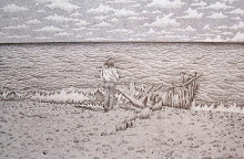
After I completed the tree’s and foliage I then began the grass by using my .30 mm pen for the grass in the foreground then I switched to my .25 mm pen to finish off the grass towards the distant foliage. Refer to the study samples I have provided on my Flickr account. Every technique I use to create my works can be found there. Once I completed the grass I began the stippling for the beach sand. First though I used my .30 mm pen to stipple in the footprints in the sand I had sketched in earlier. If you are doing just the beach scene I suggest you add footprints and maybe some dead wood that has washed up along the shoreline. This just adds visual interest and helps add 3 dimensionality to your work. Once I finished with these it was nothing but using my .25 mm pen to create the stippling in the beach…be patient, this will take a long time for the beginners. In the next post I will be covering the waves and water and maybe begin covering the sky. Also I am thinking on finding a new site to post my lessons. I also post the same lessons on my Blogger account and will most likely switch entirely to that in the near future. I will continue posting photo samples of the lessons to Flickr so you may just go there also. Any questions just ask!
When I begin detailing the tree and surrounding foliage I first will decide which ones will be the prominent and those that will look detailed but in actuality there is very little detail involved. I began working on the tree closest to me using my .30 mm pen and using the techniques I have previously went over (refer to flickr account and look for the tree’s and foliage worksheet) and I complete that tree first. I then move on to the second most prominent, the third and so forth. If you’ll notice on the second prominent tree I have used very small circles tightly bunched together. This technique offers a great texture for tree’s that you want to indicate some detail but you do not want to overpower the more prominent tree’s. Once I completed all the circles I then just over it again using my .25 mm pen and just scribble in some shading in the leaves themselves. For the most prominent tree to my right I only shade near the visible branches using the cross hatching technique. This will be the ONLY tree using the cross hatching technique because of the fact that when you are trying to convey foliage which in and of itself has absolutely no straight lines using cross hatching to much will leave the piece looking very two dimensional…try and avoid this as much as possible unless you give each line a slight curve and this can be difficult not only in the hours it will add to your work but cross hatching in foliage can go very wrong very fast …use this technique ONLY when you feel completely comfortable with your pens. Practice on some scrap paper all the different tree and foliage techniques and see what most fits your ability at this time. Get these completed and I’ll cover the distant foliage and also the beach sand. Any questions email me and I’ll get back to you asap.
When you are doing your initial sketch only sketch out what you need to see. Don’t go overboard sketching out every little detail such as the blades of grass or the leaves or any other detail that you will just basically go over again anyways. It may help you in some areas but what you will soon learn if you do that consistently is that it really is a waste of time and effort. There are pieces I have created that have so much stippling in it that I have blisters in between my fingers…if I tried to do this with every piece I would be literally unable to complete more than five to six pieces a year if I were that lucky…KEEP IT SIMPLE…it’s a sketch! I first want to get a feel for the piece I am working on and to do that in this piece I began laying ink to the birch tree directly to “my” right. I use my .30 mm pen and just ink in a few of the leaves there…just to give me a feel of how the depth of the tree line as it progresses towards the distant Marquette lighthouse. I choose several of the tree’s that will be the dominant foliage. These are the ones I will apply detail as opposed to those making up the distant tree line. As I work my way back I drop down to my .25 mm pen. Once you do just a bit of each this will help you keep in mind of how heavy you want to apply the ink or how lightly. I then just finish those prominent tree’s for now. This should take you all about three to five days so I’ll go over so get your sketch worked out and I’ll go over detailing the leaves and foliage in next post. Any questions just ask!
First my apologies for the two month hiatus but I have a solo show in May 2009 and I am concentrating on more surreal realist works. This is the next piece I will be breaking down in steps for you all. This piece is titled: “Uh Oh!…who’s judging who? , Pen and Ink/Conte Pencil , 24 inch x 36 inch , $3000.00USD. This piece is now on exhibit at the Oasis Gallery, 130 W. Washington Street (Masonic Building), Marquette, Michigan 49855 in their annual Donor’s Show 2009. A reception will take place on February 20th at 7-9pm. Which will coincide with the Sled dog races that begin in Marquette. That doesn’t mean I will be there but can be upon request…I so hate crowds of people. But I will try and be there if I can convince myself too : ) So please go and enjoy the exhibit, it runs from February 1st thru the 28th and most importantly support your local artist’s and galleries! Now back to the piece. We will go over every step and technique I used to create this piece and for you more advanced I expect you to be able to super impose yourselves onto whatever similar piece you choose so get your equipment ready and stretch those fingers…time to get them incredibly sore! I will make sure to post the lessons each week at least until mid April when I may have to take another two week hiatus because will be getting works delivered to The Kerredge Gallery in Hancock for the May show so until next post get your subject ready and your table set up!
I am a professional artist living in the beautiful Upper Peninsula of Michigan. I make my living as an artist. Most of my time is dedicated to creating my works and finding galleries and basically anywhere that I may show and possibly sell my art work. My entire life really revolves around art and just trying to continue to make a life and living as one! In this blog I hope just to share ideas, lessons & tips using pen & ink and other mediums as I create my art.
Original Pen & Ink Artwork. 22" x 28". Awarded Honorable Mentions at "Artist's of the U.P. 2007" and also "Northern Exposure 14th Annual Juried Art Competition 2007". $1000.00 USD