Sunday, March 2, 2008

CALL FOR ENTRIES!


Here are some upcoming art competitions I want to pass along to any interested. First of all is Strokes of Genius 2: The best of Drawing Light and Shadow. DEADLINE: March 31, 2008. Artwork Eligibility: Artwork can be in any dry medium or wet medium applied in a linear fashion that would be traditionally considered drawing. This includes, but is not necessarily limited to, pencil, charcoal, conte, PEN & INK:), scratchboard and silverpoint. Colored [pencil, pastel and even some paint mediums if used in a drawing-like manner are acceptable. E-mail for more info or an e-mail of the application form...time is short for that! The next is The Artist's Magazine 25th annual Art Competition. DEADLINE: May 1, 2008. This competition also has a Student/Beginner Division. Compete and win in 5 categories: 1) Abstract 2) Animal/Wildlife 3) Landscape/ Interior 4) Portrait/Figure 5) Still life Go to http://www.artistsmagazine.com/ to download and application form and also read the rules and prize information.

Thursday, February 28, 2008

Trees & bushes...


First of all I apologize for not updating lesson sooner but I had the flu and just didn't feel like it BUT I do apologize for the inconvenience! Now as I said before, I want to practice on some very basic tree and bush techniques. You can make any tree incredibly detailed but lets keep it relatively simple to start with. The example photo is another great practice piece. This is a very simple technique I use to create distant pines and the like. It only really requires two of the basic pen techniques we have covered before...fine line work and scribbling. Fine line work outlines the shape of the small pine while the scribbling is used to fill the tree in and give it excellent texture. In the next blog we will cover bushes then jump back on the piece.

Wednesday, February 20, 2008

Creating trees and foliage...


Before I go any further on the piece I want to share this simple study & practice lesson I use at my workshops for beginners. Here are some basic ways to create trees and foliage. I use a lot of vertical line work when doing far distant trees and bushes that are too far away to see such things as branches and the like in any sort of detail. If you will go to my Flickr account I have an album there where you can find many useful study sheets if you do not want to wait for me to post a lesson. In the next blog I will continue on the road as you practice the basics on trees and then I will share more detail lessons on trees and foliage.

Monday, February 18, 2008

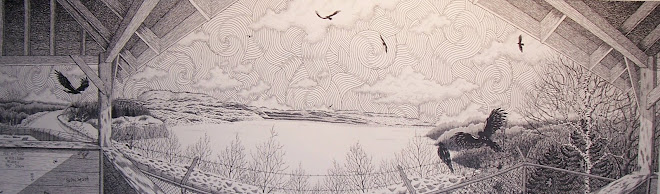
"The dead end road"...shadows in the shadow


On the banked snow on the left side of bridge that is mostly in shadow I want to begin adding the "shapes" in the snow so I take my .35 mm pen and in a uniform, tight pattern I stipple small ridges and dips in the piled snow. As I did before on the other side I will loosen my stippling pattern when I work towards the outer edge of each shape. Also remember to continually graduate your stippling patterns looser and looser as you work your way back. Your eyes cannot pick up that amount of detail from a great distant so do not try and add it in any of the pieces you are working on. Ignore the shapes of the trees I began working on. I want to go over the basics again of trees before moving on so that is what I will do a quick "go over" in the next blog. And another reminder...I am setting up my new site and will eventually just use it for the lessons so keep the following address! http://www.stacyvaughndavis.blogspot.com/

Saturday, February 16, 2008

"The dead end road"...distant details


I've once again tried to enlarge this study photo so you can see how I have really loosened the stippling as I went towards the distant end of the bridge. I always draw simple rough outlines of where I may want to indicate shadows. I follow this outline with tighter stippling but as I reach the outer edge of those outlines I put more and more space between each single dot. Do not just go from tight stippling to noticeably spaced stippling, gradually increase the space between each single dot and avoid hitting the same dot twice. It only intensifies the stippling. I really do stress the fact that a bit of practicing before trying to do this type of stippling is a must. I will go over the shading on the left side of bridge and some of the road in the next blog. Also I want to remind everyone I am getting ready to make a switch over to a new site where I will continue posting lessons & tips and any other information you may can use. http://www.stacyvaughndavis.blogspot.com/

Thursday, February 14, 2008

"The dead end road"...snowbanks & shadows continued


I continue working towards my horizon's vanishing point and use my .25 mm pen to work my way stippling in the shadows of the banked snow. Now when you are working on your piece and you are creating snow on your piece, keep in mind that you do not want a lot of really tight detailed stippling on snow. If you try and do this you will quickly begin over working it and adding so much detail to a shadow it just will not look good at all! Try to remember to always keep it simple when you are doing snow in pen & ink. Also study the sample photo to see how I continually & gradually loosen up the tightness of my stippling as I work towards my horizon line. Now, on a separate matter. I am now in the process of moving my "lessons & tips" blog to another site due to the upcoming changes at Yahoo 360. I will try to continue posting blogs here at 360 but the following address will be my main blogging site from now on. anyone & all can still view the lessons there as well as ( hopefully) here. My Flickr photo samples will also remain available for everyone to view and study as needed and I will add a link at the following site: http://www.stacyvaughndavis.blogspot.com/ In the next blog I will jump back over to the left hand side of bridge to begin adding the detail to the shadow cast by the railing and also begin on the snow covered road.

Tuesday, February 12, 2008

"The dead end road"...details & shadows of the rail


I hope you can see this well enough. I wanted you to see how I have gradually stippled lighter and lighter as I worked to my vanishing point. I also have stippled in the shadows of the vertical rails of the bridge. I stippled these in with extremely tight overlapping stippling to create a very dark distinct shadow. I also have to keep in mind that, because the way I "kind of" play with perspective, I have to cast the shadows as if my light source is coming from many different directions. I love doing this because no matter how "wrong" this may seem...it completely works! It just doesn't look good when I don't do this technique. I also love how as I continually add more and more, the piece is already grabbing you! In the next blog I will complete the rail and and begin working on the distant road towards the gate.