skip to main |
skip to sidebar
 Now for the final lesson and sample for this piece you just need either Conte’ Pencils or some good quality pastels or pastel pencils…whichever you prefer and also your .25 mm pen to complete the stippling in the hat. Now I ca only go over what I HAVE done on my piece so I give it to you step by step. IF you do not have a self portrait of yourself on your piece then ignore this.
I first complete my hat by just lining it in with my .25 mm pen and then filling in with some loose stippling. Add more stippling by overlaying to indicate shading and use line work to indicate the stitching in the hat and also any logo’s on it. Once that is complete I clean the pen in my ink cleaning solution and set aside.
Now here is the simplest part of the work…this is nothing more than what we did as children with a coloring book our parents bought us. You just color it in! I first begin by using flesh tone colors on my face. I avoid placing any color in the eyes yet . I then switch to a sepia color but just go with what YOU feel is right for you. I sparingly add any shadows to the bridge of my nose and cheeks using a stump to blend both colors to soften it out. ALWAYS add darker colors on lighter colors sparingly because when blending with a stump you’ll be amazed how it can spread. I then add a dark brown to my eyes and use the stump once again to soften the tone. I do the same thing on the fingers starting from light to dark. You may want to leave the large hand for last because you do not want any smearing of colors but you basically will do the same on the small hand as you will on the large.
I’ll begin lessons on a new piece I was commissioned to do as a Christmas gift. Any questions just email!
www.stacyvaughndavis.bogspot.com
www.flickr.com/stacyvaughn68
www.360.yahoo.com/stacyvaughn68
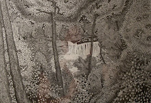
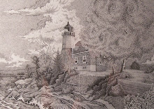
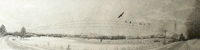
 Basically for most of this entire piece I have been using only my .25 mm pen and .30 mm pen. Except for the night sky and also the crow’s which I used my .30 mm pen to outline the high lights on the wings and such then came back and filled in with a 1.20 mm pen which makes filling in large areas of ink so much easier although be careful because does lay down a large amount of ink and tends to dry slowly so pay attention to any chances of smearing the ink into areas you do not wish it to be. Once I completed filling in the large black areas I then used my .30 mm pen to just add some small quick line work to the feathers but not all of them. Keep some of them free of any ink to give more high lights to the birds wings.
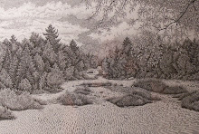
Now for the background of the sky I used my .25 mm pen and used the swirl technique but much more tightly spaced then in any other piece I have covered before. It is extremely difficult so if you wish you can use either just a nice stippled in background or more loosely placed swirls. It really is a wonderful technique because it just makes you see movement in a 2 dimensional piece. For the clouds I just used some loosely placed stippling to add some depth and dimension and also texture to the clouds.
In next post I will cover the mediums I used to create myself and my hand. Any questions just email me and I’ll get back to you as soon as I possibly can.
http://stacyvaughndavis@blogspot.com
www.flickr.com/stacyvaughn68
http://360.yahoo.com/stacyvaughn68
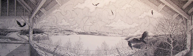
 Now in the first step of this lesson I just want you to think of the sky in two simple steps. The first step will be the night sky and the second will be a more intense swirled sky. I’ll go over the first step in this lesson.
First sketch out any thing such as birds or planes or stars or what have you that will NOT be completely covered in with ink. Once this is completed then all you need to do is take the largest pen size you have available and begin filling it in. I suggest you use your pens but you can use a brush BUT keep in mind that using a brush will tend to leave lighter areas and you will need to go over these but when you do keep in mind that a large amount of wet ink in one area will make the paper buckle AND can also damage the surface of the paper. Using your pens may take longer but is so much more controlled and it tends to force you to be patient and pen & ink requires patience above all else! I like to go over any large area that has been inked in like this several times and going in different directions much like you would with cross hatching.
In next post we’ll go over second step of completing the sky. Any questions just ask.
http://stacyvaughndavis@blogspot.com
www.flickr.com/stacyvaughn68
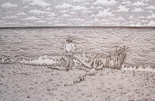
 After I completed the tree’s and foliage I then began the grass by using my .30 mm pen for the grass in the foreground then I switched to my .25 mm pen to finish off the grass towards the distant foliage. Refer to the study samples I have provided on my Flickr account. Every technique I use to create my works can be found there.
Once I completed the grass I began the stippling for the beach sand. First though I used my .30 mm pen to stipple in the footprints in the sand I had sketched in earlier. If you are doing just the beach scene I suggest you add footprints and maybe some dead wood that has washed up along the shoreline. This just adds visual interest and helps add 3 dimensionality to your work. Once I finished with these it was nothing but using my .25 mm pen to create the stippling in the beach…be patient, this will take a long time for the beginners.
In the next post I will be covering the waves and water and maybe begin covering the sky. Also I am thinking on finding a new site to post my lessons. I also post the same lessons on my Blogger account and will most likely switch entirely to that in the near future. I will continue posting photo samples of the lessons to Flickr so you may just go there also. Any questions just ask!
http://stacyvaughndavis@blogspot.com/
www.flickr.com/stacyvaughn68
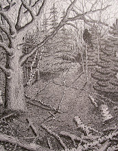
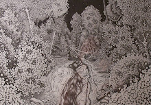
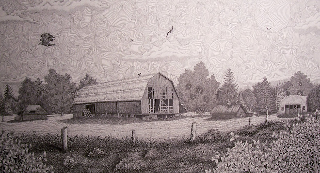
 When I begin detailing the tree and surrounding foliage I first will decide which ones will be the prominent and those that will look detailed but in actuality there is very little detail involved. I began working on the tree closest to me using my .30 mm pen and using the techniques I have previously went over (refer to flickr account and look for the tree’s and foliage worksheet) and I complete that tree first. I then move on to the second most prominent, the third and so forth. If you’ll notice on the second prominent tree I have used very small circles tightly bunched together. This technique offers a great texture for tree’s that you want to indicate some detail but you do not want to overpower the more prominent tree’s. Once I completed all the circles I then just over it again using my .25 mm pen and just scribble in some shading in the leaves themselves. For the most prominent tree to my right I only shade near the visible branches using the cross hatching technique. This will be the ONLY tree using the cross hatching technique because of the fact that when you are trying to convey foliage which in and of itself has absolutely no straight lines using cross hatching to much will leave the piece looking very two dimensional…try and avoid this as much as possible unless you give each line a slight curve and this can be difficult not only in the hours it will add to your work but cross hatching in foliage can go very wrong very fast …use this technique ONLY when you feel completely comfortable with your pens.
Practice on some scrap paper all the different tree and foliage techniques and see what most fits your ability at this time. Get these completed and I’ll cover the distant foliage and also the beach sand. Any questions email me and I’ll get back to you asap.
www.flickr.com/stacyvaughn68
www.blogspot.com/stacyvaughndavis
 When you are doing your initial sketch only sketch out what you need to see. Don’t go overboard sketching out every little detail such as the blades of grass or the leaves or any other detail that you will just basically go over again anyways. It may help you in some areas but what you will soon learn if you do that consistently is that it really is a waste of time and effort. There are pieces I have created that have so much stippling in it that I have blisters in between my fingers…if I tried to do this with every piece I would be literally unable to complete more than five to six pieces a year if I were that lucky…KEEP IT SIMPLE…it’s a sketch!
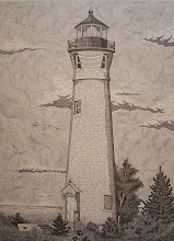
I first want to get a feel for the piece I am working on and to do that in this piece I began laying ink to the birch tree directly to “my” right. I use my .30 mm pen and just ink in a few of the leaves there…just to give me a feel of how the depth of the tree line as it progresses towards the distant Marquette lighthouse. I choose several of the tree’s that will be the dominant foliage. These are the ones I will apply detail as opposed to those making up the distant tree line. As I work my way back I drop down to my .25 mm pen. Once you do just a bit of each this will help you keep in mind of how heavy you want to apply the ink or how lightly. I then just finish those prominent tree’s for now.
This should take you all about three to five days so I’ll go over so get your sketch worked out and I’ll go over detailing the leaves and foliage in next post. Any questions just ask!
www.flickr.com/stacyvaughn68
 First my apologies for the two month hiatus but I have a solo show in May 2009 and I am concentrating on more surreal realist works. This is the next piece I will be breaking down in steps for you all. This piece is titled: “Uh Oh!…who’s judging who? , Pen and Ink/Conte Pencil , 24 inch x 36 inch , $3000.00USD.
This piece is now on exhibit at the Oasis Gallery, 130 W. Washington Street (Masonic Building), Marquette, Michigan 49855 in their annual Donor’s Show 2009. A reception will take place on February 20th at 7-9pm. Which will coincide with the Sled dog races that begin in Marquette. That doesn’t mean I will be there but can be upon request…I so hate crowds of people. But I will try and be there if I can convince myself too : ) So please go and enjoy the exhibit, it runs from February 1st thru the 28th and most importantly support your local artist’s and galleries!
Now back to the piece. We will go over every step and technique I used to create this piece and for you more advanced I expect you to be able to super impose yourselves onto whatever similar piece you choose so get your equipment ready and stretch those fingers…time to get them incredibly sore! I will make sure to post the lessons each week at least until mid April when I may have to take another two week hiatus because will be getting works delivered to The Kerredge Gallery in Hancock for the May show so until next post get your subject ready and your table set up!
www.flickr.com/stacyvaughn68
http://360.yahoo.com/stacyvaughn68